Before I go any further, this isn’t about creating professional covers for your novels. If you’re putting together a book to self-publish then you’ll want to do this thing properly, which most likely involves hiring an artist and/or designer. However, you probably won’t want to commission covers for one-off short stories and smaller projects – they don’t quite justify the expenditure. That’s where using more off-the-shelf components can be useful and still yield visually pleasing results.
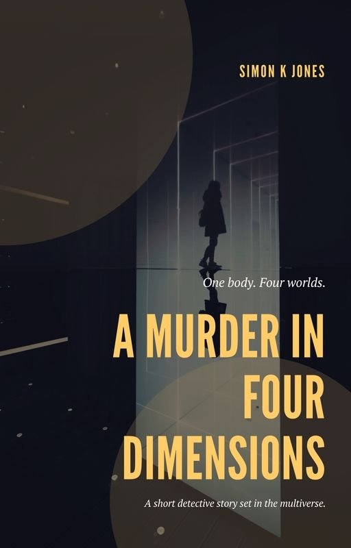
Earlier this year I wrote a short story called A Murder in Four Dimensions, which is a noirish detective tale set in a single evening. Having published it recently over on Wattpad I decided to give it a unique cover which would help me promote it. I ended up with this:

Like I say, if you’re making the cover for your next big novel you’re going to want to hire a proper designer but for the purposes of this short story, the cover came out looking very effective. It’s a quick DIY job, making use of templates and stock footage. I should point out that the only reason this approach works, and the only reason the cover came out so well, is thanks to the talent of the original designer of the template and the photographer of the stock image.
In fact, while we’re at it, here’s the photo credit: Photo by Alessio Lin on Unsplash. Great job, Alessio! (incidentally, going forward, I’m going to endeavour to always credit photographers, even when I’m using free stock)
There’s a remarkable wealth of free stock imagery available online which is of a very high standard. Via the likes of Unsplash or Pexels you can find pretty much anything you need for any kind of theme. The same rules apply to this stuff as to any use of stock materials, of course:
- Avoid stock featuring people where you can see their faces. It’s an immediate giveaway of a generic stock image, and while people work well in marketing generally, a customer/reader can identify a stock person a mile away. Also, there’s a good chance a free stock image will be used by multiple people for different projects, and using an easily recognisable human is the fastest way for people to think “I’ve seen this before!”
- That’s not to say you can’t have people in the image. Just avoid it being a classic head-and-torso mid-shot. if it’s something more enigmatic, like in the image I used for this cover, then you can get away with it.
- Try to think laterally and incorporate a bit of the abstract. I didn’t search for ‘murder’ or ‘dimensions’ when looking for suitable images: I looked for ‘doorway’ and ‘corridor’. I could do this for two reasons. 1. I know my story well and understand its content. 2. I already had a clear notion of the cover’s design, even if I didn’t yet have the specifics – from the start I wanted to reference classic 1940s/50s film noir posters, complete with angled shadows and high contrast.
- Check copyright and uses the proper free libraries instead of Google Image Search, which tends to blur the line.
Finding the right stock image is 90% of the challenge with this kind of quick cover design. Alessio’s striking reflective corridor was exactly what I was after, to the point that even if I had commissioned something original it would quite possibly have ended up looking like this anyway.
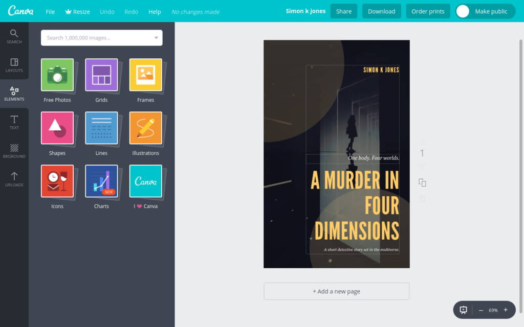
Next up was to jump into Canva to sort out the typography. Canva is an online visual design tool which is optimised for generating social media images and common types of marketing materials. It’s handy for creating blog banners, invites, promotional flyers and, indeed, book covers. A free account gives you access to a bunch of handy templates and fairly robust customisation.

One very useful aspect of Canva is that by being web-based it will run on just about anything. I have a Windows desktop for more intense design work, but Canva enables me to rattle off quick images from my Chromebook when I’m out and about.
You can create your own designs from scratch or work with templates, depending on what you’re after. Canva is entirely drag-and-drop, so you try out different ideas and adapt templates to your specific needs in very little time. Check out the video below in which I guide you through making a cover in under five minutes:
Or, step-by-step:
- Create an account over at Canva.
- Click ‘Create a design’.
- Choose a project type – in this case, ‘book cover’.
- Pick a layout, or add the elements yourself.
- Customise the text, images and layout to suit your specific requirements.
- Export to a high quality PNG image for use elsewhere!
It really is that simple.
None of this means that designers are going to be out of a job anytime soon. For the big projects where you can afford investing some cash, always hire a professional. The key thing with simple and effective tools like Canva is that it opens up possibilities for all the projects which aren’t big, and which don’t have the budget.
It’s the same advice I give when people ask about web development or making promotional videos: having in-house skills and tools is all about giving yourself choice. You don’t have to ration out the fancy presentation and only use it for your biggest projects. Combine the two and you’re in the best position, as you can’t take professionally commissioned work as the starting point.


0 Comments