I wrote about creating the cover for A Day of Faces way back in July 2015. You can check that post out over here. I recently redesigned the cover, so thought it made sense to do a bit of a before/after.
Without further ado, on the left you can see the original cover and on the right you’ll find the redesign:
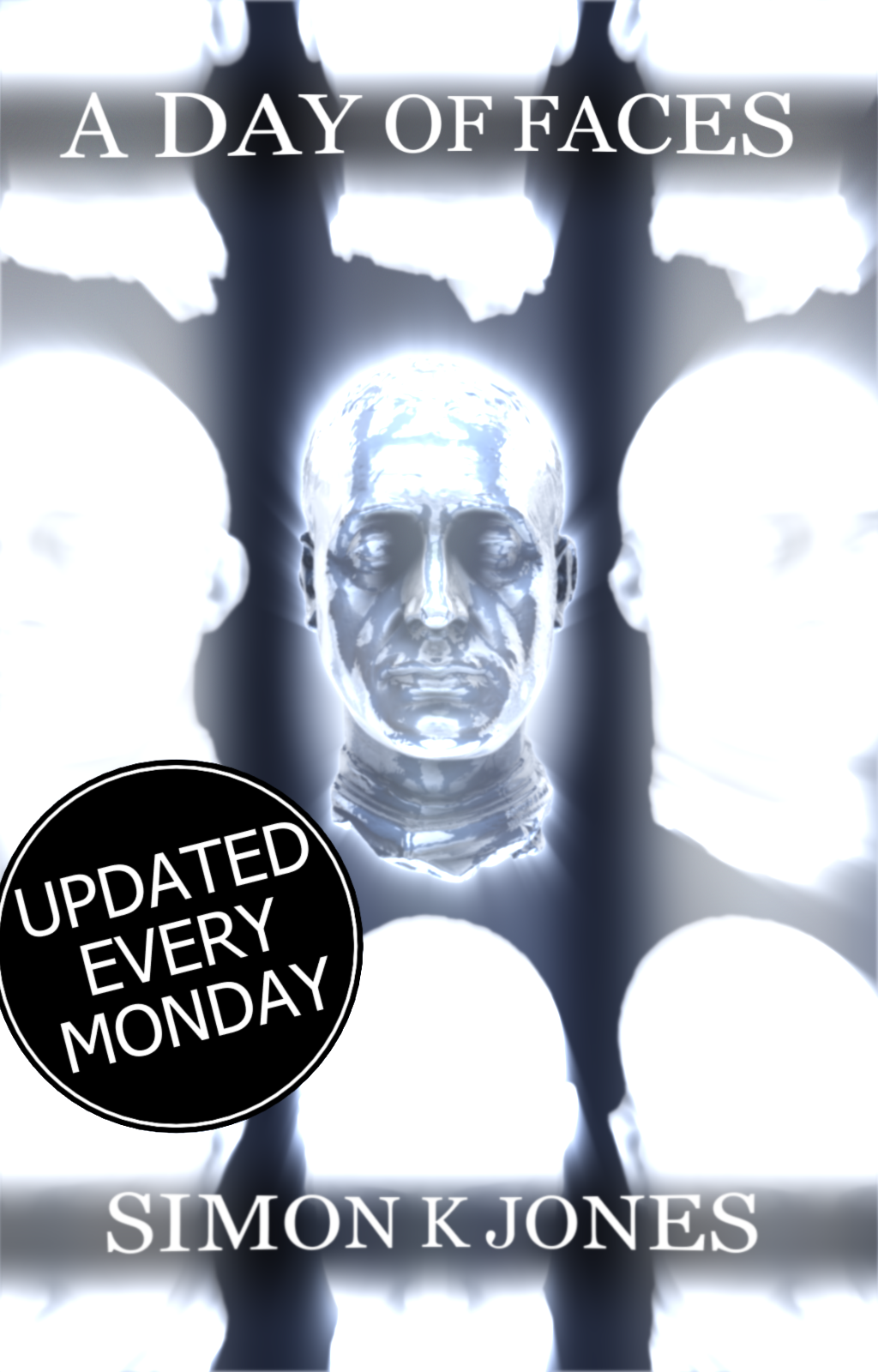
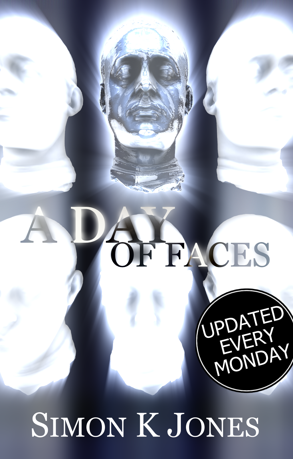
Now, the first thing that should be said about both of these covers is that I’m absolutely not happy with either of them. I think they both have merit but neither quite do the job. In an ideal world I’d hire a professional artist/designer and have something created – I imagine that’s something I’ll do before the end of 2016 but, for now, this is what there is.
I much prefer the actual title treatment on the new cover (the one on the right, remember). ‘A Day of Faces’ is quite a long, unwieldy title and the single line arrangement on the original cover always felt a bit dull and over-wide. I tried to make it more interesting by adding a slight curvature, but that ended up looking pretty tacky.
The new two-liner with the larger ‘A DAY’ is immediately more interesting, enables all the text to be larger than before, and gives the four word title a kind of pacing in how your brain scan across it.
I’ve also altered the positioning and number of heads. I prefer the angle on the hero head, but on reflection I think the framing on the original cover was more successful. I think splitting the difference and going back to the original head layout but with them all titled back could work better.
This is all temporary measures until I get that professionally designed cover. The goal at the moment is to have something which is still intriguing and eye-catching without being an embarrassment.
Let me know what you think, and which you prefer. And if you’re a designer, drop me a line with your rates and let’s talk.

0 Comments